TGA Football academy
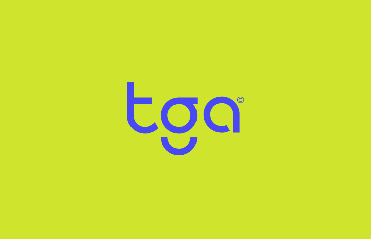
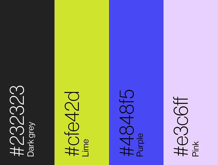
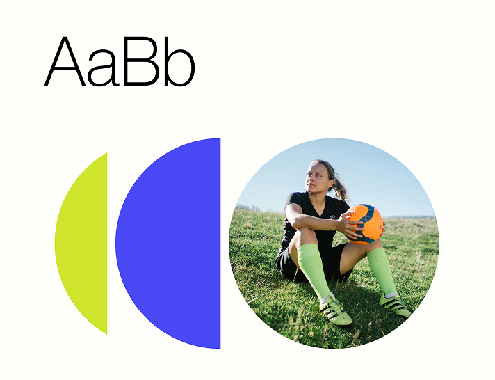
TGA Football Academy for Girls approached me to create a bold, energetic rebrand that would inspire confidence and stand out within youth sport. The identity was designed to feel modern, empowering and instantly recognisable across both digital and physical touchpoints. At the centre of the brand is a custom logotype, with the distinctive “g” inspired by the curved markings of a football pitch. This subtle detail gives the identity a sense of movement and connection to the sport, while maintaining a clean, minimal aesthetic. The wider visual language expands on the geometry of the logo, using repetition, duplication and cropped circular forms to create a dynamic system that feels kinetic and fast-paced. Combined with a vibrant lime and electric purple colour palette, the branding captures the academy’s energy, ambition and focus on empowering young female athletes. The final identity was applied across social assets, campaign graphics, pitch-side advertising and branded materials, creating a cohesive and memorable brand presence both on and off the field.