
Global trade observatory Branding
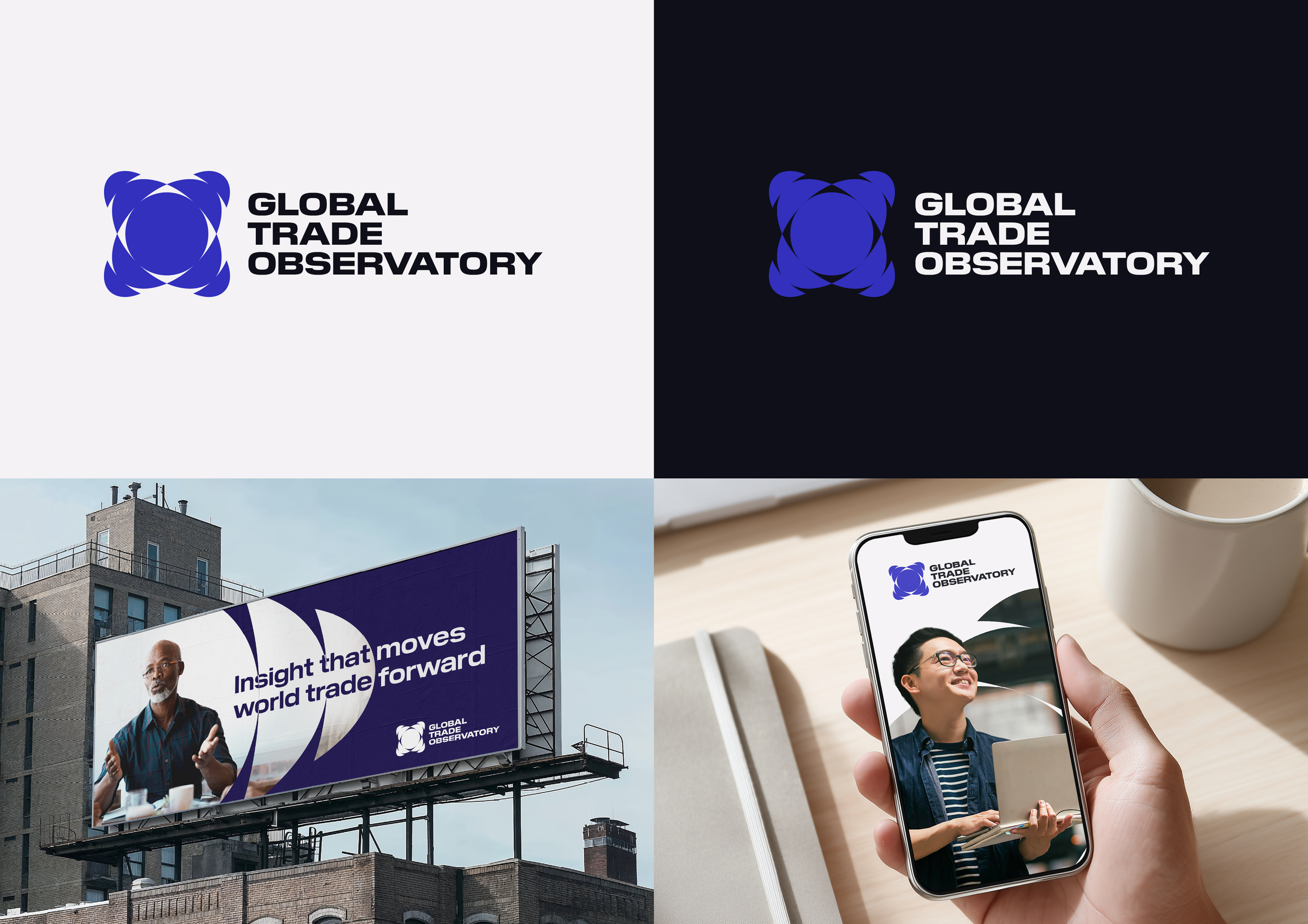
Global Trade Observatory was developed for DP World as a forward looking publication focused on global trade forecasting, data analysis and market insight. The project explored three distinct identity routes, each designed to communicate clarity, connection and perspective within complex global data systems. Using bold geometric forms, circular framing devices and luminous gradients, the visual language represents the flow of information, interconnected markets and the wider picture behind trade intelligence. The final concepts were designed to bring clarity to complex research, transforming data driven insight into a modern and accessible brand experience across digital and campaign applications.
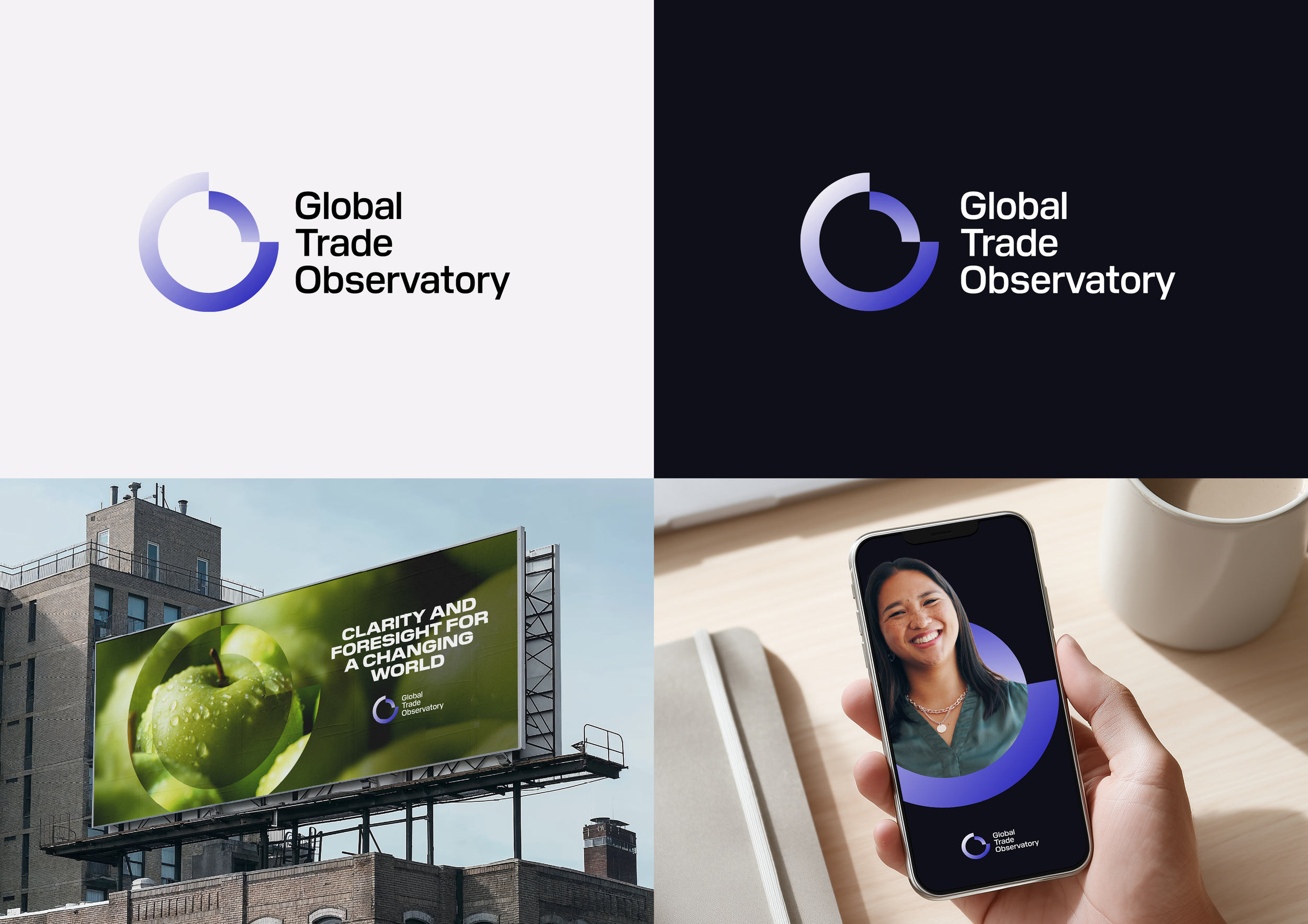

Concept 1
A lens of clarity
Insight and intelligence into understanding. A logo that represents a lens, reflecting insight and bringing clarity to an ever changing market, giving you a clearer view.
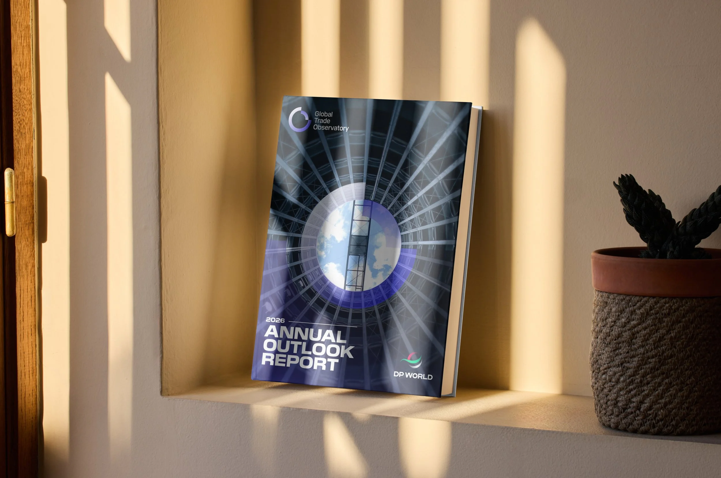

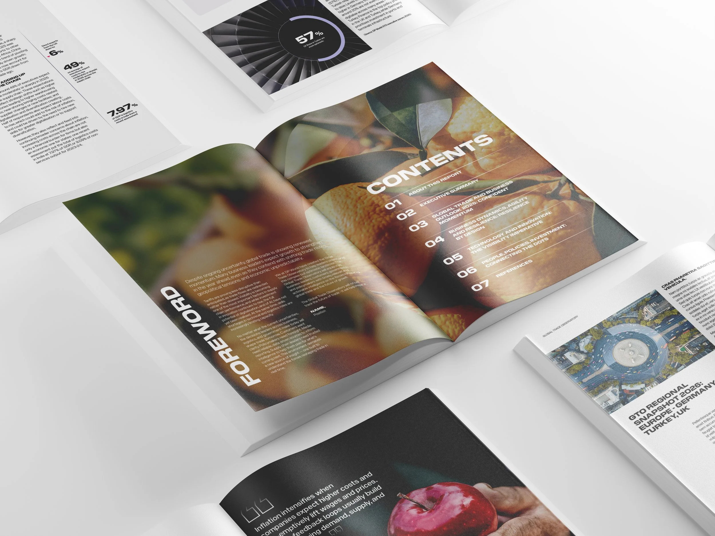
Concept 2
GLOBAL data
The brand mark is a dynamic visual device that can evolve and adapt in response to changing contexts. The result is a unified expressive collection of mark variations, creating a brand identity that reflects the scale of the data collected and the depth of the research.

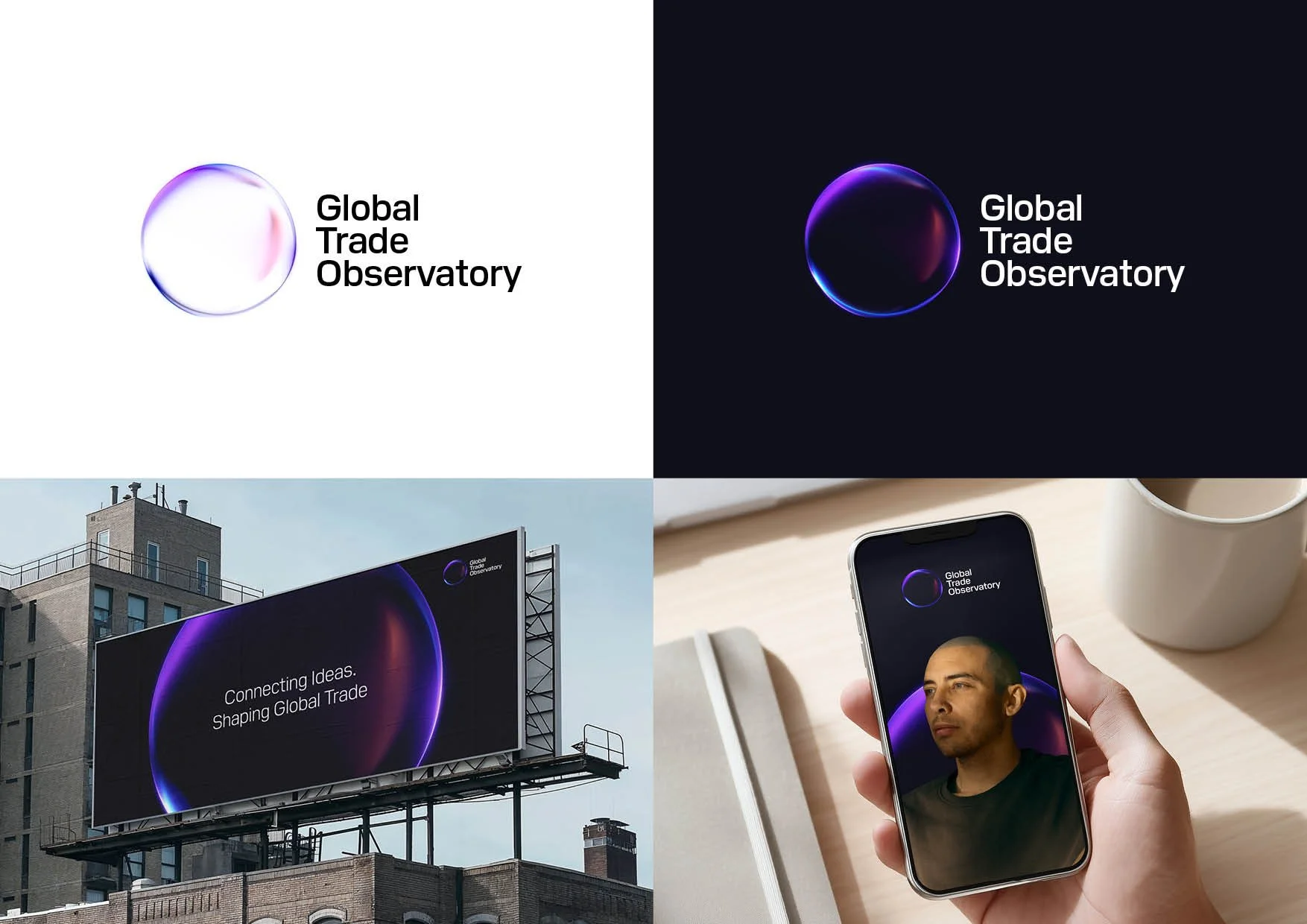
Concept 3
Ripple effect
Research guiding smarter decisions across industries. The mark is built from a repeated pattern, symbolising the flow of insight that guides smarter decisions across industries and creates a positive ripple effect throughout the global market.

The wider context
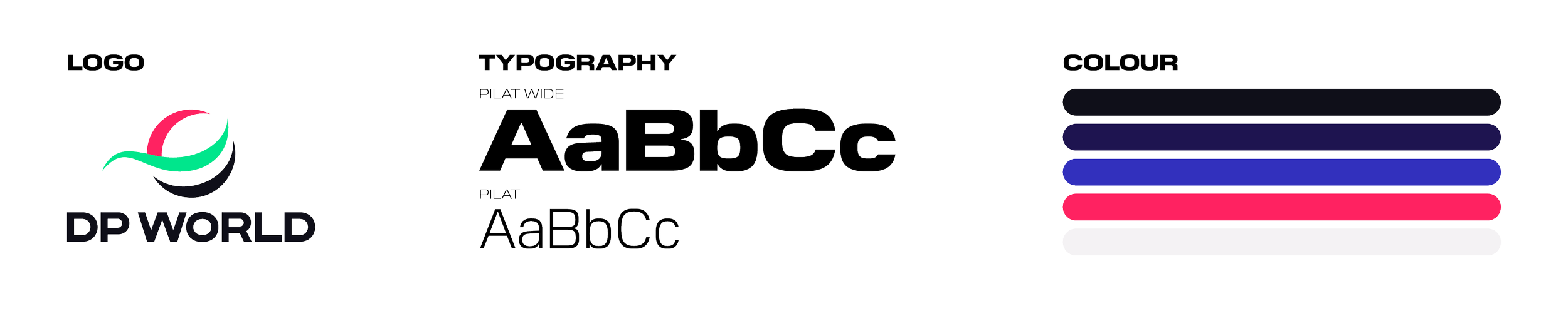
This work was developed within the existing DP World brand framework, ensuring alignment with established brand guidelines. To maintain consistency, I used the approved colour palette and typography shown below.