
Client: AstraZeneca
Role: Lead brand designer
Category: Healthcare
Caresa was developed as a sub brand within AstraZeneca, designed to support smarter, more innovative and sustainable patient care pathways. The identity combines organic forms, clean typography and a vibrant colour palette to create a modern and human centred brand system inspired by connected care and sustainability. Alongside the logo design, the project included social assets, iconography, brand guidelines and marketing collateral, creating a cohesive visual language across all touchpoints.

Colours From nature
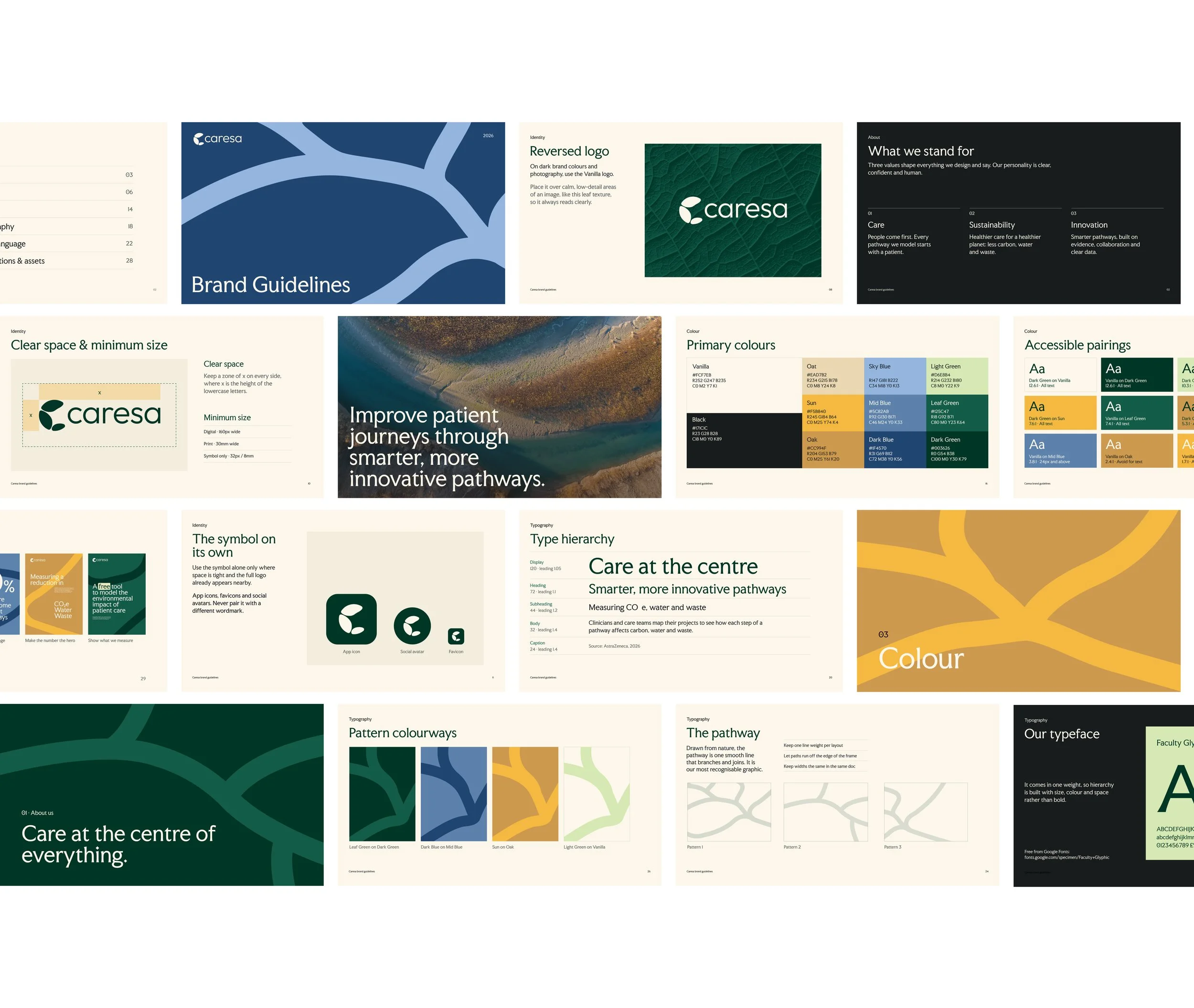
A palette rooted in nature, reflecting the environment CARESA helps protect.


The Caresa brand guidelines: logo, colour, typography and the pathway graphic, brought together in one system.
Brand Guidelines

Logo design
The Caresa symbol is built entirely from circles and ellipses. This geometric construction gives every curve a precise, consistent rhythm, so the mark feels balanced and natural while remaining unique to the brand.
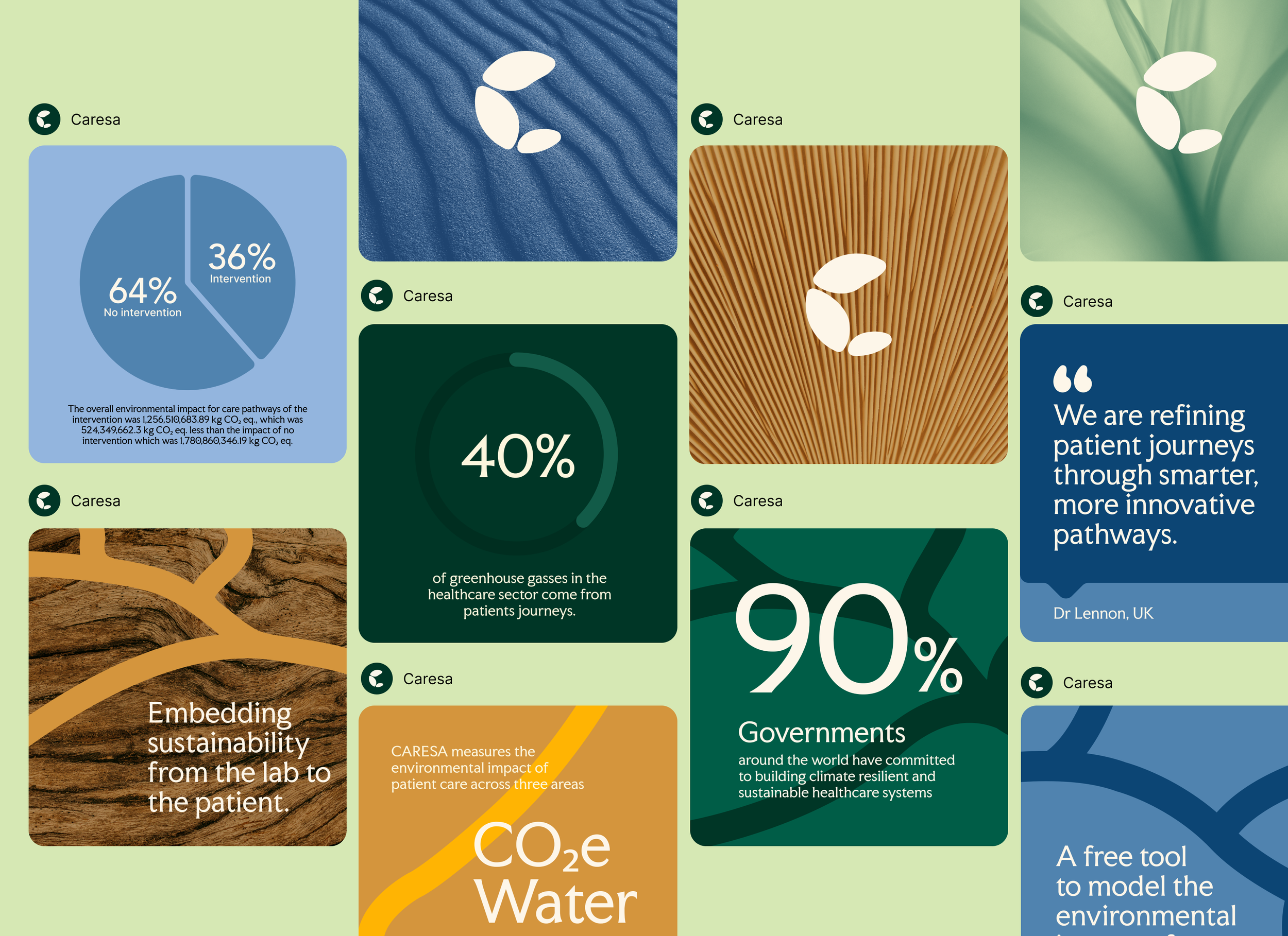
Social
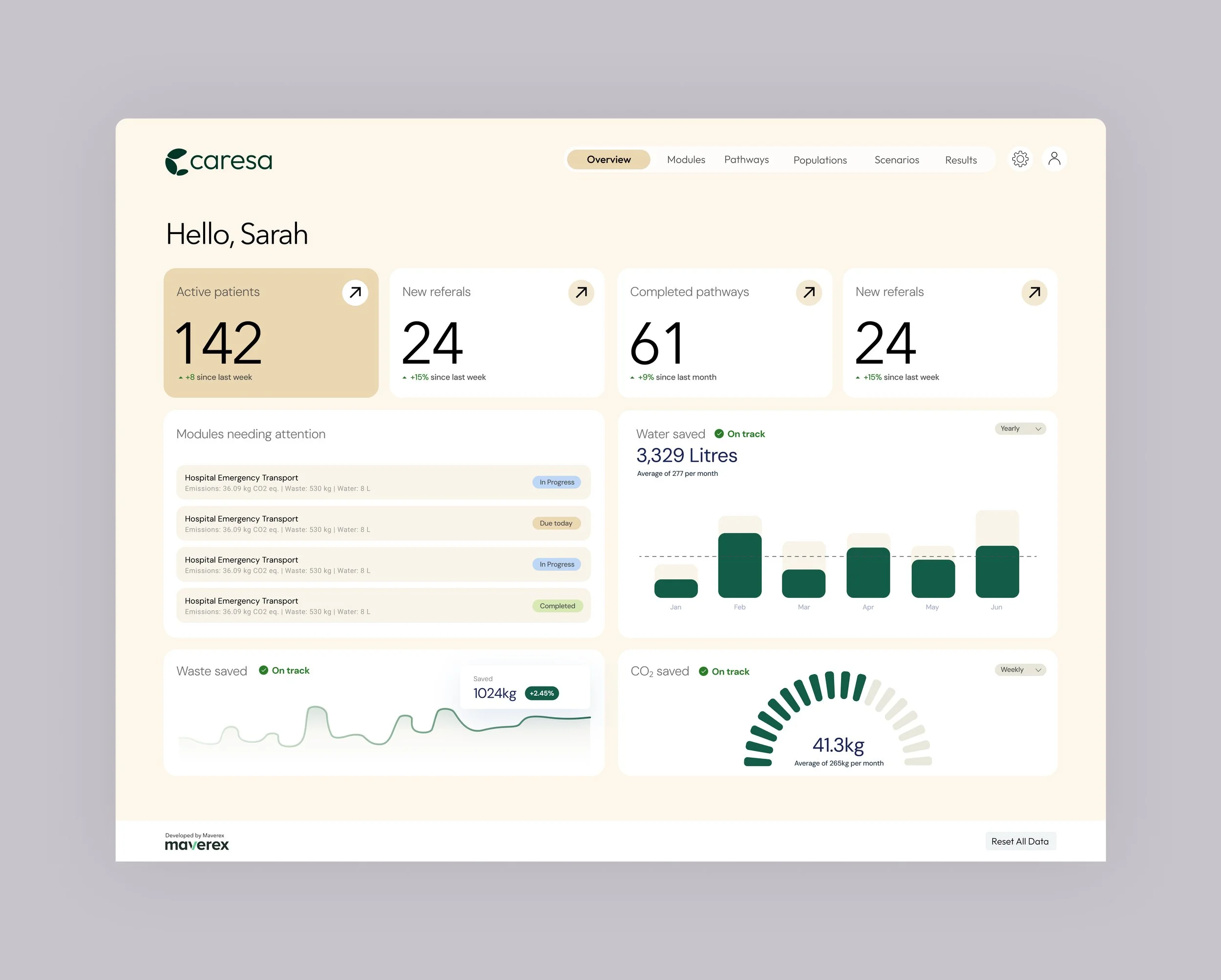
The brand comes to life in the CARESA platform, a dashboard where clinicians and care teams track the environmental impact of patient pathways. Key figures like CO₂, water and waste savings are surfaced clearly, so teams can see at a glance where they’re making a difference.
Dashboard UI
Some designs shown here have been refined since launch to reflect how I’d develop the identity further.